The New Johnny Bigg Logo
22 August 2025
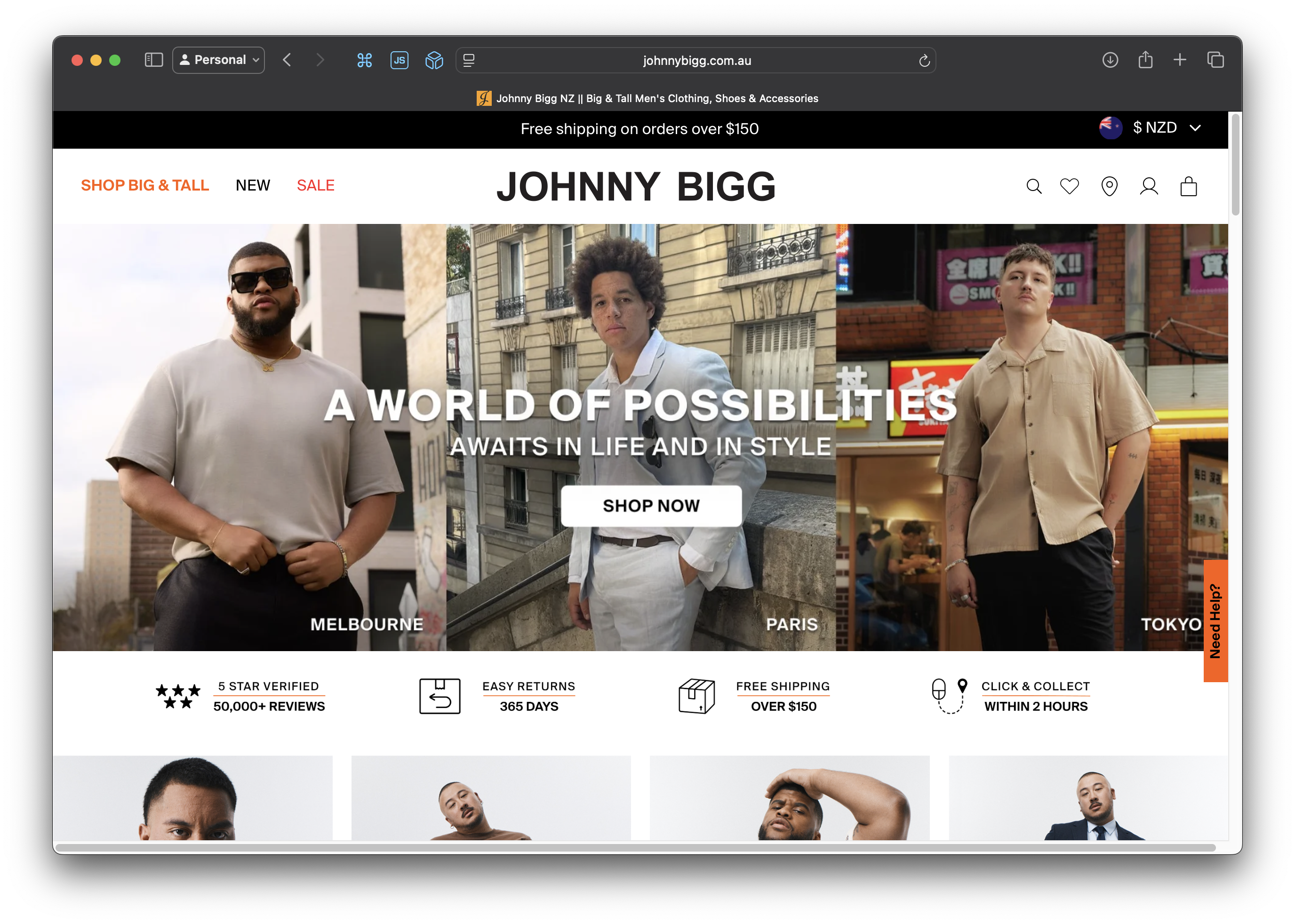
My favourite clothing store, Johnny Bigg, recently changed their logo.
When I first saw it, I thought there was a rendering issue on the website, like the font didn't load.
But then seconds later it dawned on me that it was just a new logo.
Sigh. Yet another brand to change their logo to "just a font", removing all traces of personality and originality.

Their old logo looked classy and it was recognisable from across a shopping mall. Their new one looks like the placeholder image for a phone contact. It couldn't be more basic, just black text on a white background in a boring sans-serif font. Anyone could recreate this in a text editor in under 30 seconds. They haven't rolled out this logo to stores yet but I guess it will blend in with all the other fashion stores.

I still love their clothes and continue to buy them, but this new logo is just very disappointing.